My role: Experience Designer & Front End Developer
Collaborators: Producers, designers, copywriters, QA testers, marketing team, and SEO specialists.
When I first joined the Wild Hearts website project, I knew we had something special on our hands. The game was a brand-new IP from EA Originals, set in a world inspired by Japanese mythology, with colossal Kemonos and intricate crafting mechanics using the Karakuri system. My job as the Experience Designer was to bring that world to life online.
The goal was clear: create an immersive and engaging website that would unveil the game’s world, drive pre-orders, and serve as a hub for players to connect with the game. But the challenge? We had only three months to do it. It was ambitious, to say the least, but I was excited to tackle it with an incredible team of producers, designers, copywriters, QA testers, marketers, and SEO specialists.
The biggest challenge we faced was how to capture the depth and beauty of Wild Hearts in a single website. This wasn’t just about providing information; it was about creating an experience. We needed to:
1. Translate a rich, mythical world into a digital format that felt alive and captivating.
2. Make navigation simple and intuitive for a global audience with varying levels of familiarity with hunting games.
3. Stand out in a competitive market dominated by titles like Monster Hunter.
On top of that, we had to work within a tight timeline, with frequent updates and close collaboration across teams to ensure everything aligned with the broader marketing strategy.
Research and Discovery
Before diving into design, I started with research. I wanted to understand not only the audience but also what would make Wild Hearts unique.
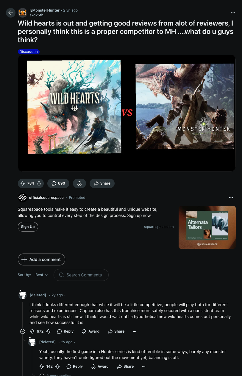
I studied competitors like Monster Hunter World and Monster Hunter Rise to see what worked and where we could differentiate ourselves. I also spent time in gaming forums and on social media, analyzing community sentiment to identify what players loved about hunting games.
What stood out was the audience’s deep appreciation for immersive worlds, stunning visuals, and easy-to-navigate sites. These insights helped us strike a balance between storytelling and functionality. We also conducted usability testing with early wireframes to ensure our ideas resonated with players.
Path to Adventure: The Roadmap
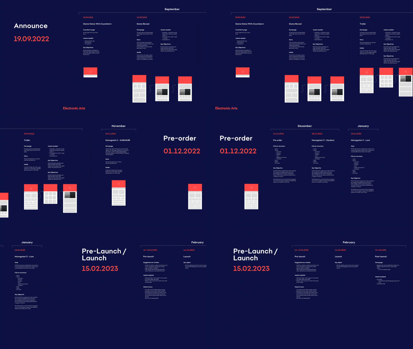
Our design process focused on the players, ensuring every phase of the website's development aligned with their needs. After understanding our audience, we partnered with the marketing team and studio to structure the project into three clear phases. Each phase had a specific goal: sparking curiosity, driving pre-orders, and delivering an immersive experience.
Announce Phase
Goal: Spark curiosity and intrigue players.
This phase was all about pulling players into the world of Wild Hearts while leaving room for speculation. We designed mysterious content that teased the game’s Japanese mythology-inspired themes, colossal Kemonos, and the innovative Karakuri system.
This phase was all about pulling players into the world of Wild Hearts while leaving room for speculation. We designed mysterious content that teased the game’s Japanese mythology-inspired themes, colossal Kemonos, and the innovative Karakuri system.
The idea was to give just enough information to spark excitement without revealing too much. Visually compelling content and dynamic scrolling effects were used to build intrigue and keep players coming back for updates.
Pre-order Phase
Goal: Build player commitment.
In this phase, we shifted focus to creating a clear and simple path for players to pre-order the game. From the homepage, users were guided seamlessly to the pre-order section through strategically placed CTAs and engaging content.
In this phase, we shifted focus to creating a clear and simple path for players to pre-order the game. From the homepage, users were guided seamlessly to the pre-order section through strategically placed CTAs and engaging content.
To optimize the experience, we tested wireframes with small player groups. Their feedback led to key adjustments, such as refining the pre-order journey to make it intuitive and engaging.
Launch Phase
Goal: Deliver a polished, immersive experience.
The Launch Phase was where everything came together. This was the final push to ensure the site reflected the game’s tone perfectly. We polished the visuals, refined interactive features like scrolling animations and hover effects, and created a seamless, immersive experience.
The Launch Phase was where everything came together. This was the final push to ensure the site reflected the game’s tone perfectly. We polished the visuals, refined interactive features like scrolling animations and hover effects, and created a seamless, immersive experience.
The goal here was to keep players exploring the site, diving into the game’s lore and features, and building excitement as the release date approached.
User Personas
To keep the user front and center, I developed three key personas based on our research:
1. Kenji (Core Player): An Action RPG enthusiast who values deep lore and cooperative gameplay.
2. Lila (Casual Explorer): Someone intrigued by the game’s aesthetics but less familiar with hunting games.
3. Media Writer: A journalist looking for concise information and assets to cover the game.
These personas were my guide throughout the project, ensuring the website met the needs of different users.
Design Process
The design process was where everything started to come together. I broke it down into clear phases to stay focused and aligned with the project goals.
Ideation and Sketching
I began by creating mood boards inspired by Wild Hearts’ Japanese mythology theme. These helped me visualize the tone and aesthetic for the site. Then, I sketched out rough layouts for the homepage and key user flows, such as exploring features and pre-ordering.
I began by creating mood boards inspired by Wild Hearts’ Japanese mythology theme. These helped me visualize the tone and aesthetic for the site. Then, I sketched out rough layouts for the homepage and key user flows, such as exploring features and pre-ordering.
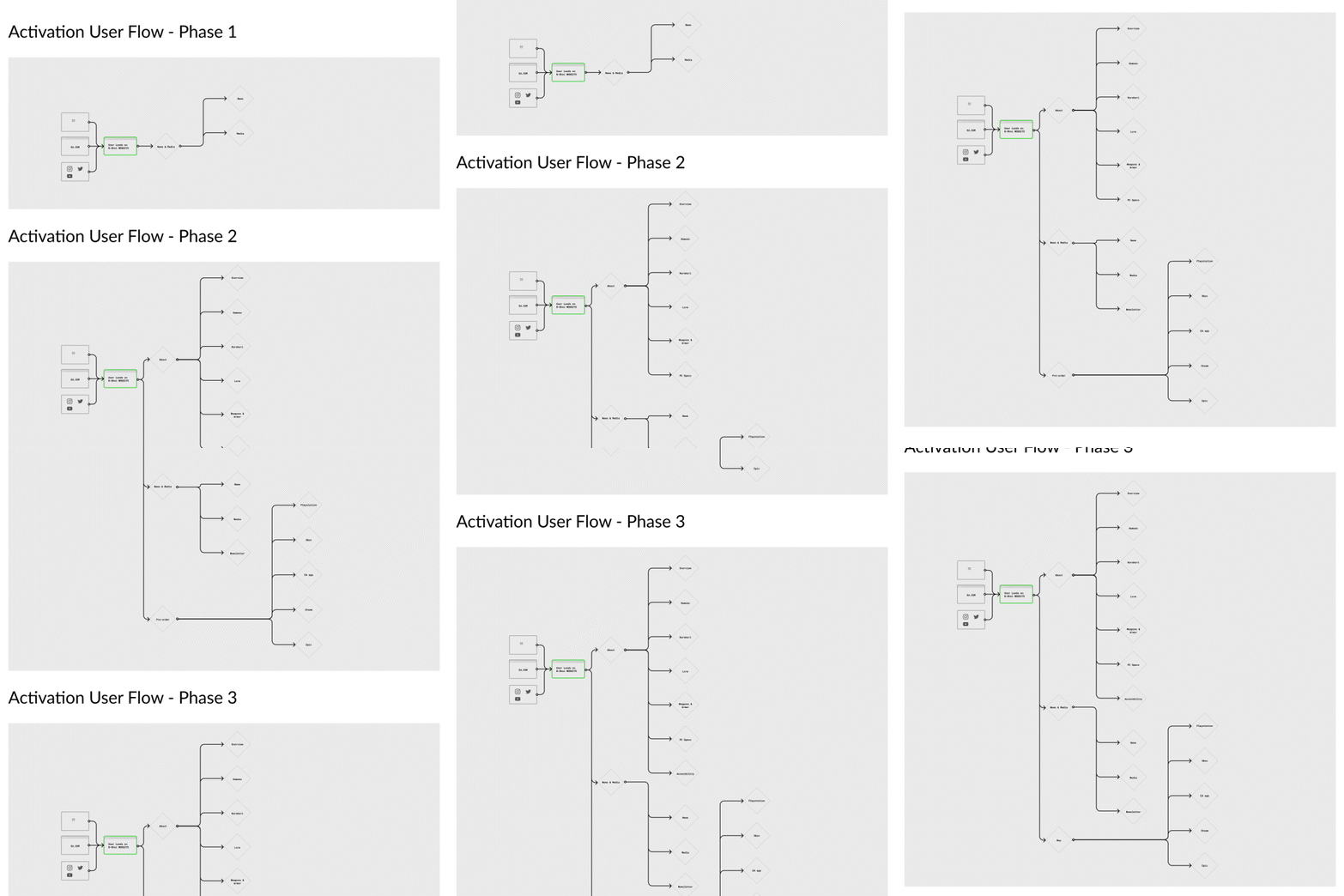
I also designed user flows that guided players through key actions, such as learning about the game’s lore, exploring gameplay features, and pre-ordering. Every detail was tested and refined based on usability testing sessions.
Wireframes were my next step, where I mapped out the website structure and navigation. Using information architecture principles, I ensured the content was organized and easy to find. These wireframes were shared with the team and tested with small groups of players, whose feedback was invaluable.
Wireframes
Prototyping & Visual Design
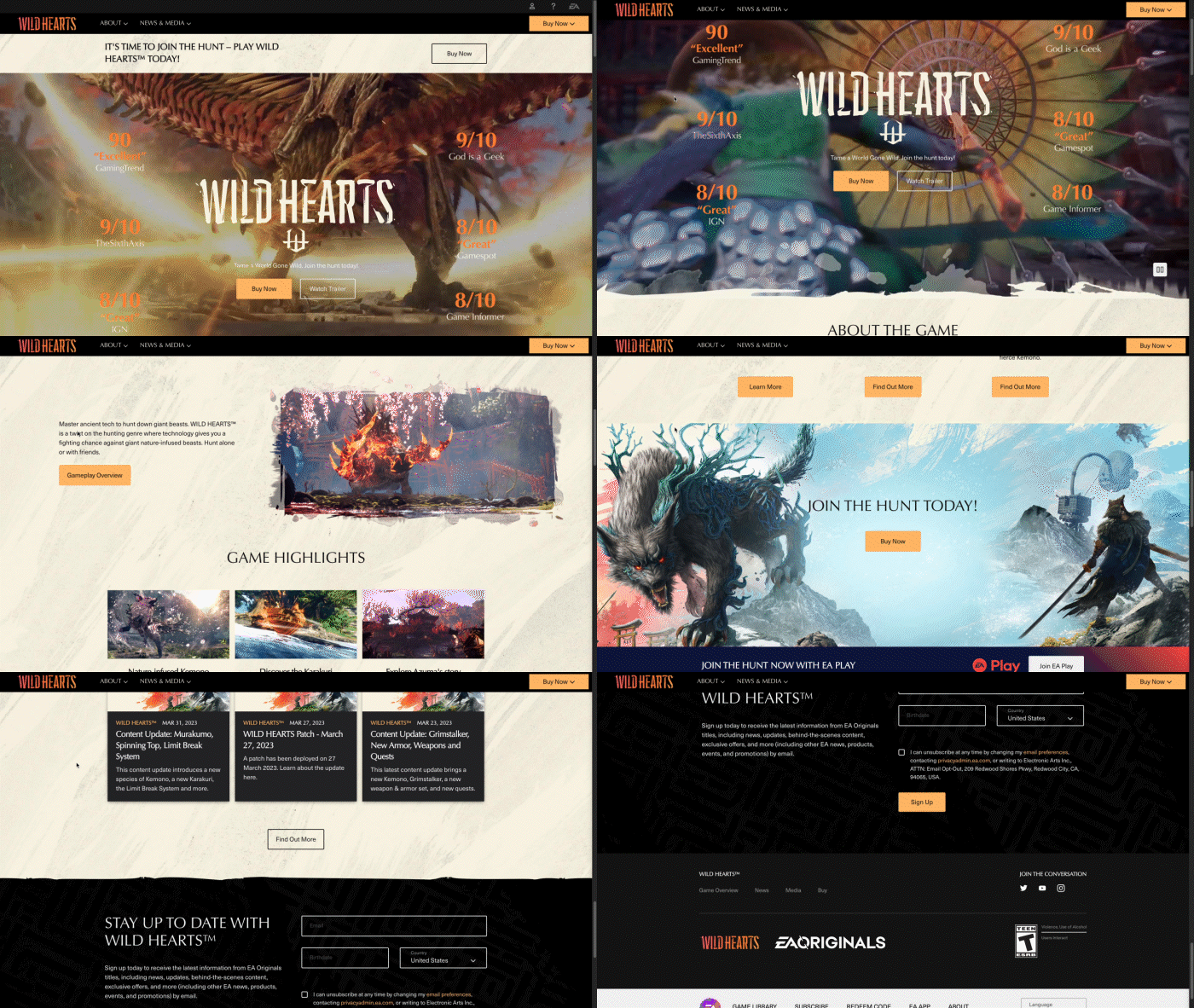
Once the wireframes were validated, I moved to high-fidelity prototypes. Using Figma, I added interactive features like hover effects, scrolling animations, and clear CTAs to bring the experience to life. These prototypes demonstrated the user flows and interactions in detail.
After finalizing the prototypes, I transitioned to front-end development. I built the pages using HTML5, CSS3, and JavaScript, ensuring the site was dynamic, responsive, and consistent with the Wild Hearts brand. The designs were implemented on Adobe Experience Manager (AEM), which allowed for easy scalability and content updates.
To ensure a smooth workflow, I collaborated closely with developers and content managers. Once the pages were developed, I handed them off to content managers, who populated the site with localized content and updated assets. This collaborative process ensured the site remained flexible and easy to maintain post-launch.
The visual design phase was one of my favorites. It was where the website really started to feel alive.
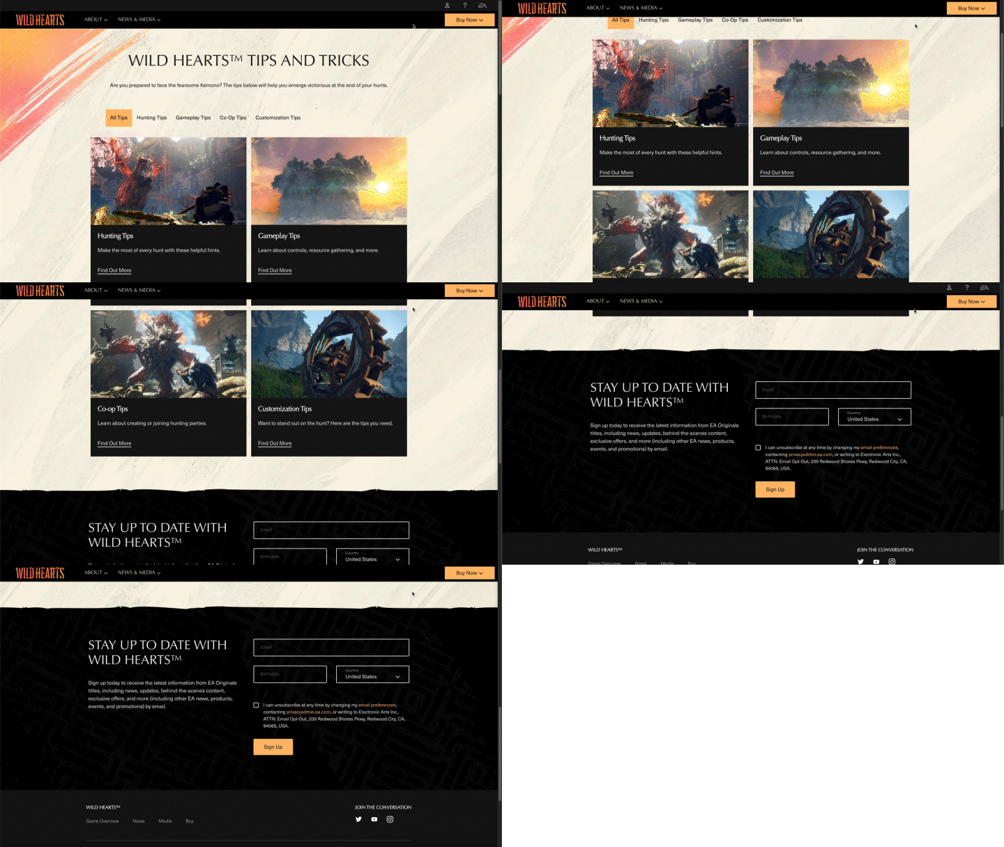
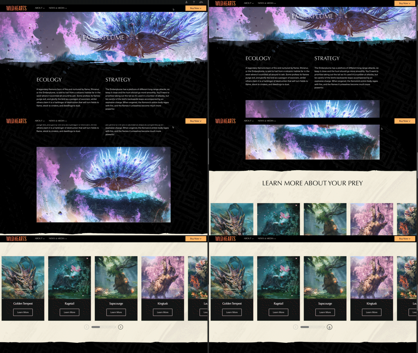
I used warm, vibrant colors inspired by Japanese landscapes and mythology to create a sense of immersion. Clean typography ensured readability, and hover effects added interactivity without overwhelming the user. Everything, down to the smallest detail, was aligned with the Wild Hearts branding to reinforce the game’s identity.
The result was a site that balanced functionality with visual storytelling, keeping users engaged from the moment they landed on the homepage.
Challenges Faced
There were definitely moments when the project felt daunting. The tight timeline was a constant pressure, and balancing the depth of the game’s world with the need for simple navigation was no small task.
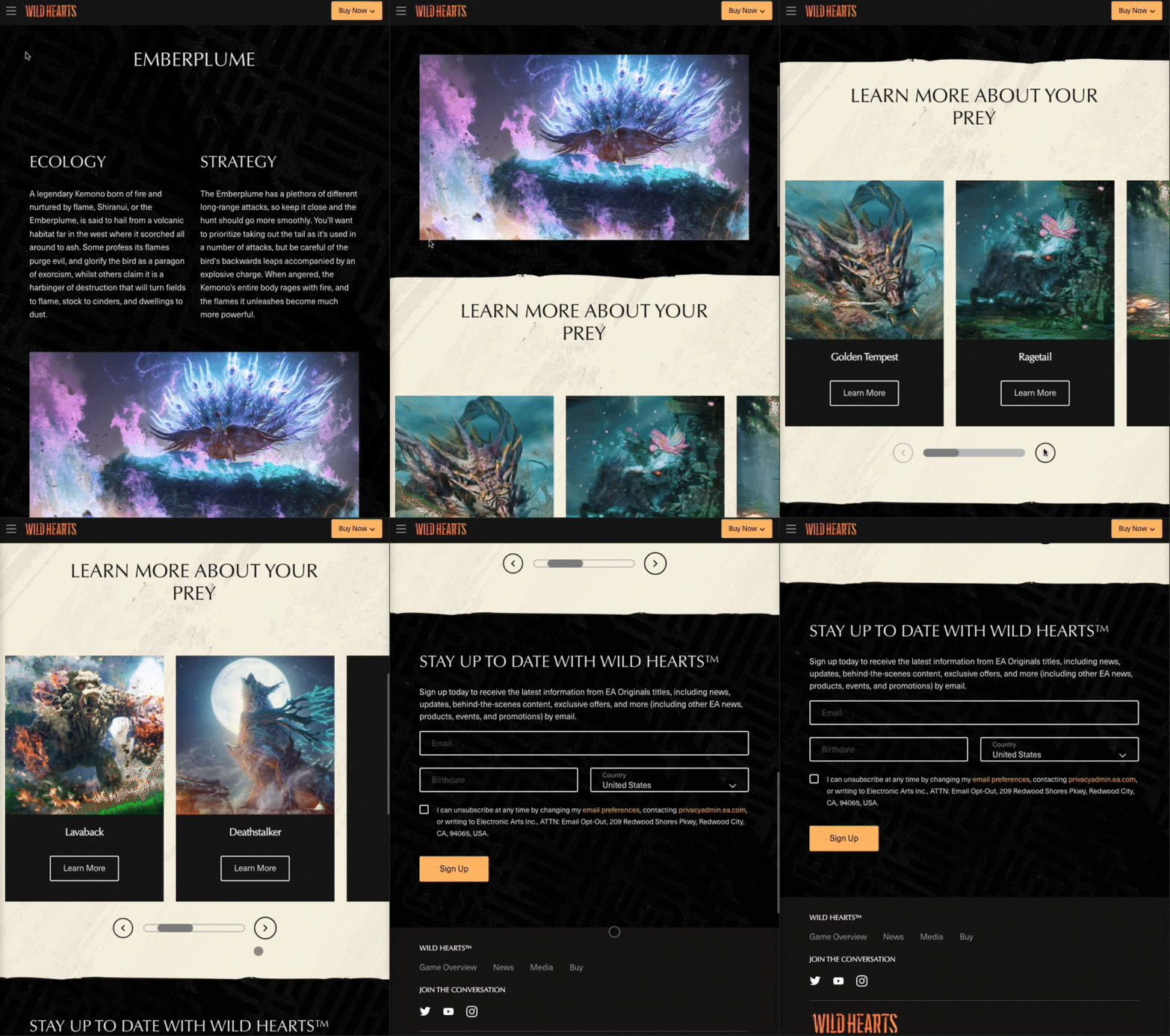
One of the biggest challenges was optimizing the site for mobile while maintaining the same level of interactivity and immersion as the desktop version. Through close collaboration with developers, we fine-tuned the responsive design to ensure a seamless experience across all devices.
Solution Highlights
Some of the features I’m most proud of include:
▪ Monster Highlights: Rotating visuals of Kemonos to immediately engage users.
▪ Interactive Storytelling: Scrolling animations that guided players through the game’s lore and features.
▪ Pre-Order CTA: Clear, intuitive pathways for users to commit to purchasing.
▪ Responsive Design: A mobile-friendly site that looked and performed just as well as the desktop version.
Results and Outcomes
The results were exciting and rewarding:
▪ Increased Engagement: Players spent more time exploring the site, with repeat visits from the community.
▪ Pre-Orders: The site successfully drove pre-orders, meeting the studio’s expectations.
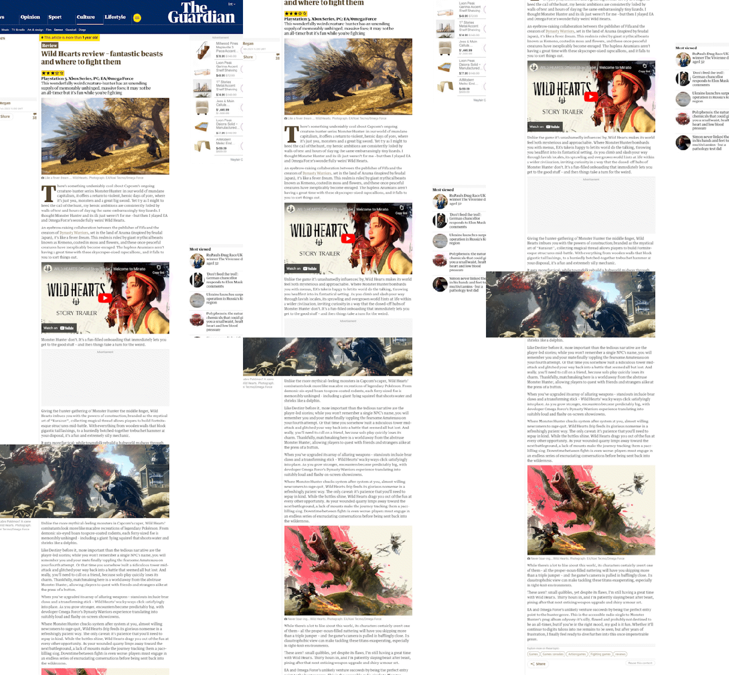
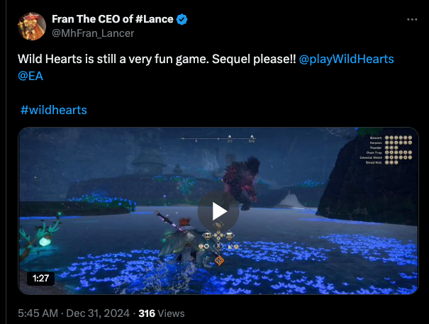
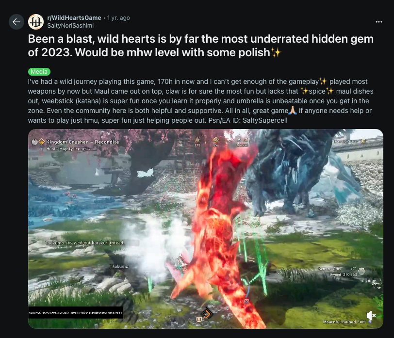
▪ Positive Feedback: Users praised the intuitive navigation and immersive visuals, which helped establish the site as a trusted hub for gameplay insights and updates.
Lessons Learned
Working on the Wild Hearts website taught me so much about how to create something meaningful for players while balancing the realities of a tight deadline. Right from the start, we knew research and accessibility would be key to getting this project off on the right foot, and they were. Taking the time to understand what players needed helped us avoid a lot of unnecessary back-and-forth later. It also ensured we stayed focused on delivering a website that worked for everyone, not just the average user.
Start Strong with Research and Accessibility
From day one, everything revolved around the players. What did they want? What did they need? And just as importantly, what might hold them back from fully experiencing the site? We dug into these questions through competitive analysis, user feedback, and testing early concepts. Designing with accessibility in mind, like using easy-to-read fonts, high-contrast colors, and ensuring screen readers worked smoothly, helped us avoid big roadblocks later on. In hindsight, this focus made all the difference in getting the project to run as smoothly as it did.
From day one, everything revolved around the players. What did they want? What did they need? And just as importantly, what might hold them back from fully experiencing the site? We dug into these questions through competitive analysis, user feedback, and testing early concepts. Designing with accessibility in mind, like using easy-to-read fonts, high-contrast colors, and ensuring screen readers worked smoothly, helped us avoid big roadblocks later on. In hindsight, this focus made all the difference in getting the project to run as smoothly as it did.
Designing for a Global Audience
Translating the site into more than 15 languages was a unique challenge. Some languages took up more space than others, which meant buttons, headings, and layouts had to flex and adapt without breaking the design. To prepare for this, we created modular components that could adjust to fit longer text without making the site feel crowded. I worked closely with the localization team to make sure nothing got lost in translation, not just words, but the tone and vibe of the game.
Translating the site into more than 15 languages was a unique challenge. Some languages took up more space than others, which meant buttons, headings, and layouts had to flex and adapt without breaking the design. To prepare for this, we created modular components that could adjust to fit longer text without making the site feel crowded. I worked closely with the localization team to make sure nothing got lost in translation, not just words, but the tone and vibe of the game.
Debugging Every Step of the Way
Debugging was another big part of the process. Every feature we added, like animations, responsive layouts, and clickable CTAs, had to work perfectly on desktop, mobile, and tablet. But when you’re designing for multiple devices, bugs are going to pop up. Animations that looked smooth on a desktop sometimes lagged on mobile, and localized content occasionally misaligned on smaller screens. Using tools like Chrome Developer Tools and Lighthouse, I caught and fixed these issues before they became bigger problems. Debugging wasn’t glamorous, but it was essential to delivering a polished final product.
Debugging was another big part of the process. Every feature we added, like animations, responsive layouts, and clickable CTAs, had to work perfectly on desktop, mobile, and tablet. But when you’re designing for multiple devices, bugs are going to pop up. Animations that looked smooth on a desktop sometimes lagged on mobile, and localized content occasionally misaligned on smaller screens. Using tools like Chrome Developer Tools and Lighthouse, I caught and fixed these issues before they became bigger problems. Debugging wasn’t glamorous, but it was essential to delivering a polished final product.
Avoiding Bottlenecks Through Teamwork
One thing I really appreciated was how well our team worked together. From developers to content managers to marketers, everyone stayed on the same page. For example, while I initially envisioned custom layouts for localized content, the content managers needed templates that were easier to maintain. We found a middle ground by designing flexible, scalable components. Early collaboration like this helped us avoid unnecessary delays and kept the project moving forward.
One thing I really appreciated was how well our team worked together. From developers to content managers to marketers, everyone stayed on the same page. For example, while I initially envisioned custom layouts for localized content, the content managers needed templates that were easier to maintain. We found a middle ground by designing flexible, scalable components. Early collaboration like this helped us avoid unnecessary delays and kept the project moving forward.
Testing Early and Often
One of the smartest things we did was test constantly. Whether it was wireframes, prototypes, or the fully developed site, we put every stage of the project in front of users. This helped us catch problems early, like navigation that felt clunky or buttons that weren’t clear, and fix them before they became bigger issues. The constant feedback loop saved us time in the long run and made sure we were delivering something players actually wanted.
One of the smartest things we did was test constantly. Whether it was wireframes, prototypes, or the fully developed site, we put every stage of the project in front of users. This helped us catch problems early, like navigation that felt clunky or buttons that weren’t clear, and fix them before they became bigger issues. The constant feedback loop saved us time in the long run and made sure we were delivering something players actually wanted.
Learning to Prioritize in a Tight Timeline
With only three months to launch, we had to be smart about what to focus on. Breaking the project into three phases, Announce, Pre-order, and Launch, was a lifesaver. Each phase had clear goals and built on the work from the previous one. This step-by-step approach helped us stay on track and avoid getting overwhelmed by the scope of the project.
With only three months to launch, we had to be smart about what to focus on. Breaking the project into three phases, Announce, Pre-order, and Launch, was a lifesaver. Each phase had clear goals and built on the work from the previous one. This step-by-step approach helped us stay on track and avoid getting overwhelmed by the scope of the project.
Conclusion
Working on the Wild Hearts website was an experience that taught me the value of putting players first. By prioritizing research and accessibility, we created a site that was not only visually stunning but also intuitive and inclusive. Designing for a global audience, with over 15 languages, pushed me to think flexibly and adapt layouts to work seamlessly across different devices and cultures. Debugging was critical to delivering a polished experience, ensuring every detail, from animations to responsive design, worked flawlessly.
Collaboration was the backbone of this project. Early teamwork with developers, content managers, and marketers allowed us to solve challenges quickly and stay on track, even under tight deadlines. The result was a website that excited players, met the studio’s goals, and created a meaningful connection with the world of Wild Hearts.
This project reminded me that great design is about balance, between creativity and functionality, beauty and usability. It’s a lesson I’ll carry with me into every project moving forward.
Thanks for reading! If you have any thoughts or would like to collaborate, I’d love to hear from you.
