When I first started working on this project, I was really excited to explore how Zooba’s vibrant and fun mobile interface could translate to desktop and console platforms. Zooba is such an engaging game that blends battle royale and MOBA mechanics, and I knew adapting it for larger screens and different input methods would be both challenging and rewarding. My role as the Lead UX/UI Designer was to figure out how to keep the essence of the game intact while making the interface work seamlessly for desktop players.
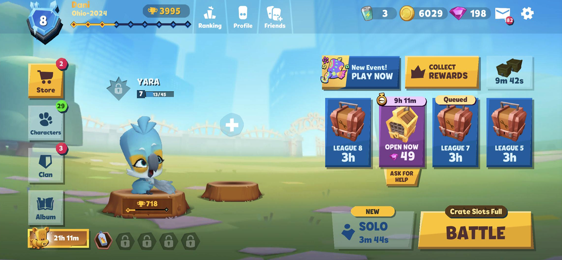
One of the biggest hurdles was translating a mobile-first design to desktop and console, where user behaviors and interaction patterns are completely different. The mobile interface had some pain points, clunky navigation, unclear hierarchy, and challenges with finding key features, that I needed to address to make the desktop experience more intuitive and enjoyable.
Goals:
1. Create a seamless, user-friendly experience for desktop and console players.
2. Enhance usability on key screens like the Main Menu, Character Selection, and Store.
3. Use the launch of the squad mode as a focal point to build excitement for the new platforms.
The scope of the project focused on adapting three key screens: the Main Menu, Character Selection, and Store. One challenge was maintaining the game’s playful branding while rethinking layouts to suit desktop players while ensuring that the designs aligned with Zooba’s overall vision.
Understanding the Problem
The first step was to identify what wasn’t working in the current mobile interface and why. On top of that, we had to account for the differences between mobile and desktop experiences. Desktop players expect quicker navigation, better visual hierarchy, and features that take advantage of larger screens and mouse-and-keyboard and controler inputs.
Our goals became clear:
1. Create an intuitive, visually appealing interface for desktop and console players.
2. Address usability issues in key screens.
3. Leverage the squad mode to generate excitement and drive engagement.
Research and Insights
To inform my design decisions, I conducted extensive research, talked to zooba players and reviews to give me firsthand insights inyo their frustation and desires. I looked at how similar games transitioned from mobile to desktop, focusing on layout changes, navigation flows, and input adaptations. Based on the research, I started brainstorming how to reorganize the layouts. I created user personas to represent both current players and potential new ones. Mapping out user flows was crucial in identifying bottlenecks and areas where the interface could be streamlined.
One idea I was particularly excited about was reorganizing the Main Menu to highlight the squad mode as the centerpiece. This not only made navigation more efficient but also aligned with the launch strategy for the desktop version.
Design Process
Phase 1: Ideation
The first step in the design process was brainstorming potential solutions. I sketched out ideas for:
▪ Main Screen: How could we make the squad mode the focal point while improving navigation?
▪ Character Selection: What layout would make browsing easy and enjoyable?
▪ Store: How could we draw attention to featured items without overwhelming users?
To guide my decisions, I created personas representing different types of Zooba players, from casual gamers to competitive enthusiasts. Mapping out their user flows helped me identify pain points and opportunities for improvement.
Phase 2: Prototyping
Once I had a clear direction, I moved on to creating mid-fidelity wireframes in Figma:
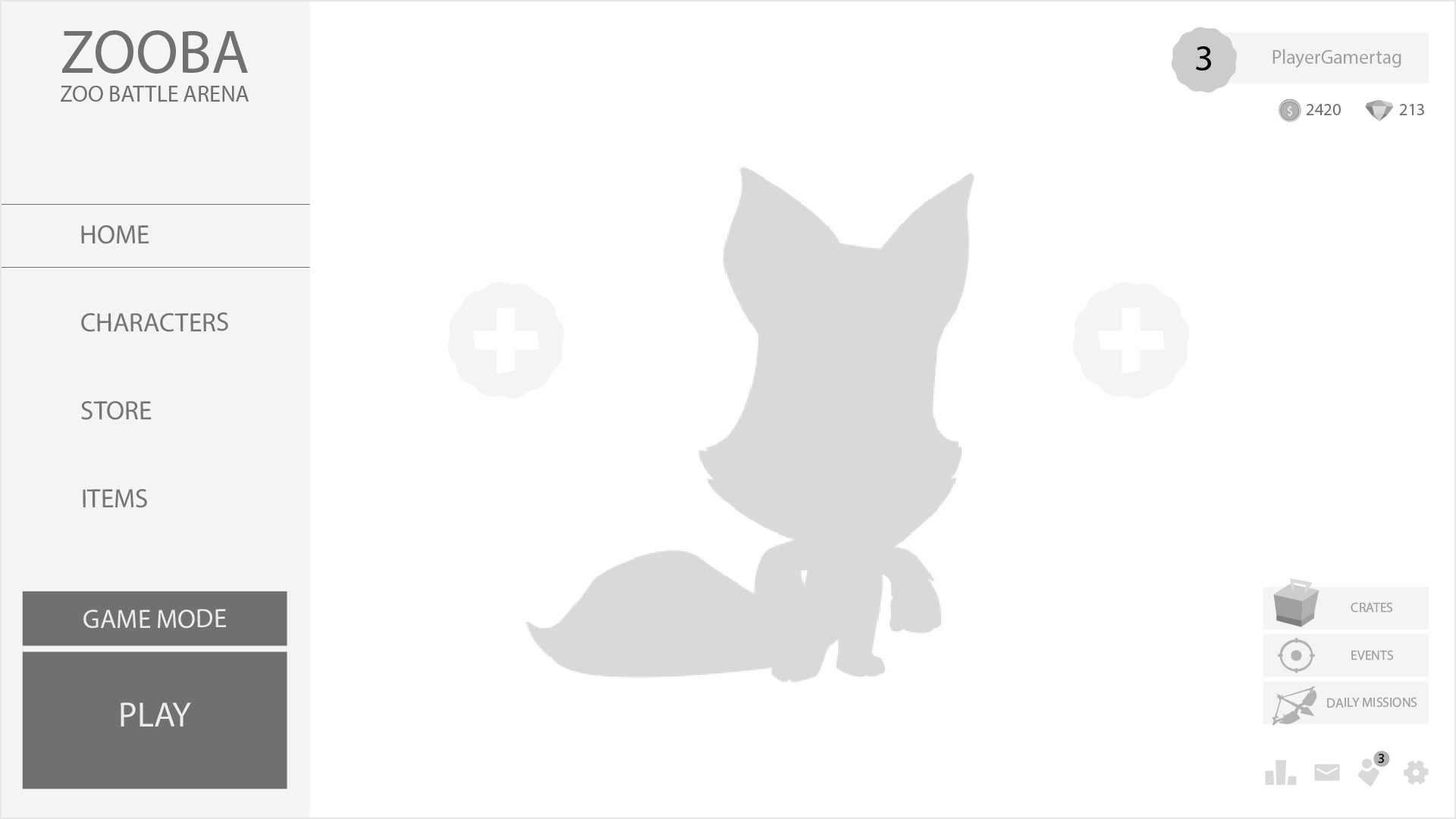
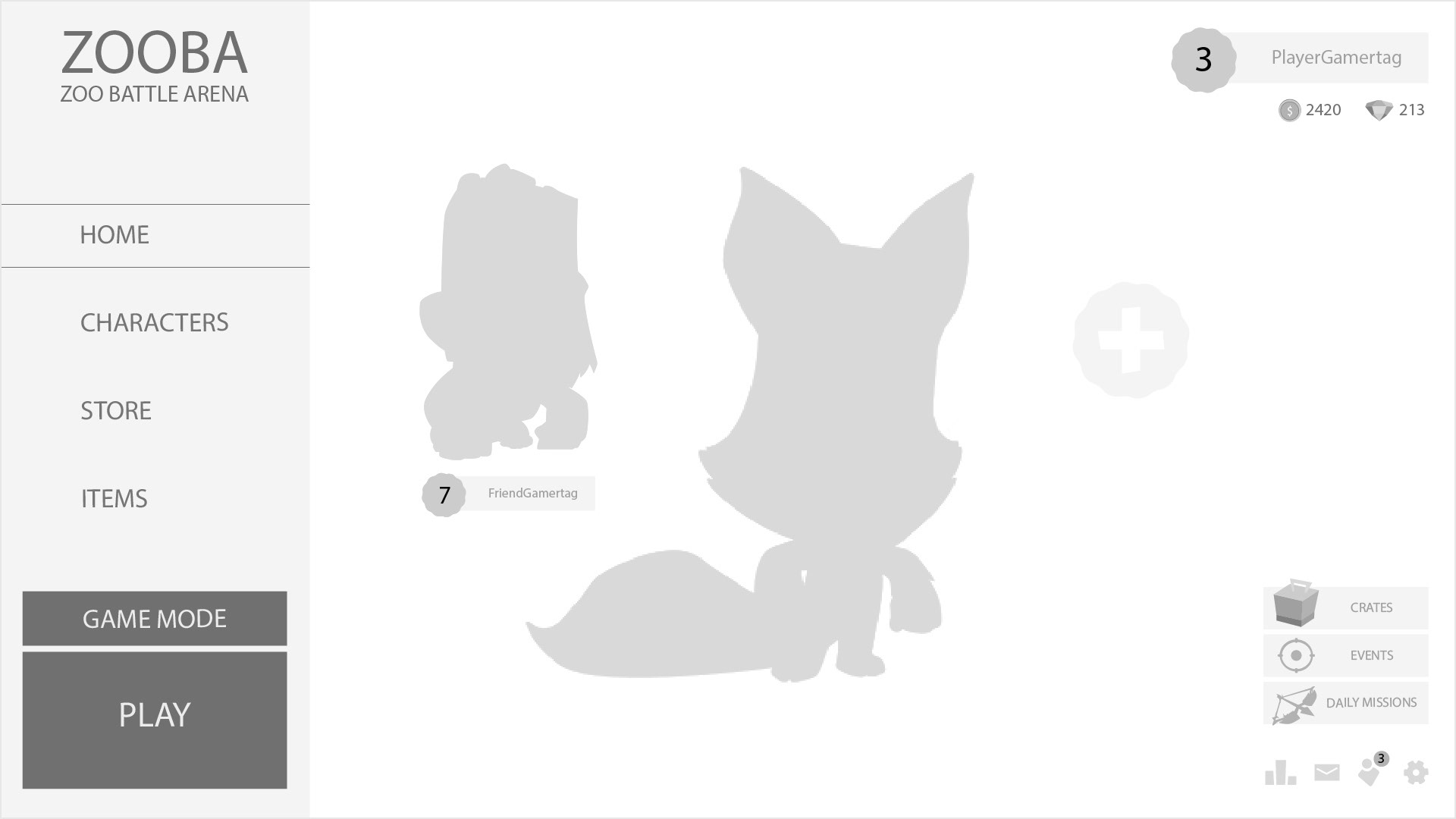
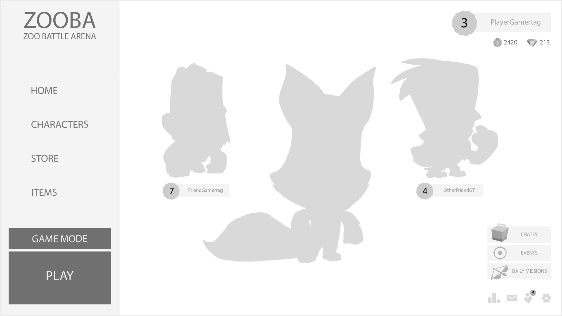
▪ Main Screen: I introduced a left-aligned navigation menu to create a natural reading flow. The squad mode button was prominently placed in the center, alongside the character visuals, to draw immediate attention.
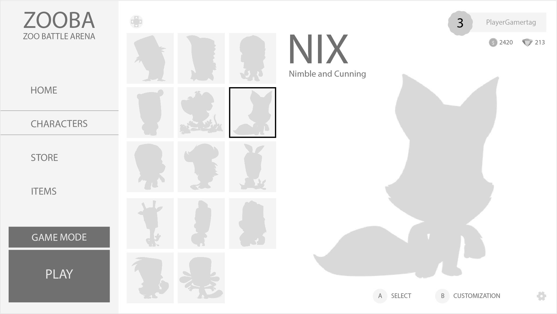
▪ Character Selection: A grid-based layout with filters made it easier to browse characters. I also added hover states to provide quick previews of stats and abilities.
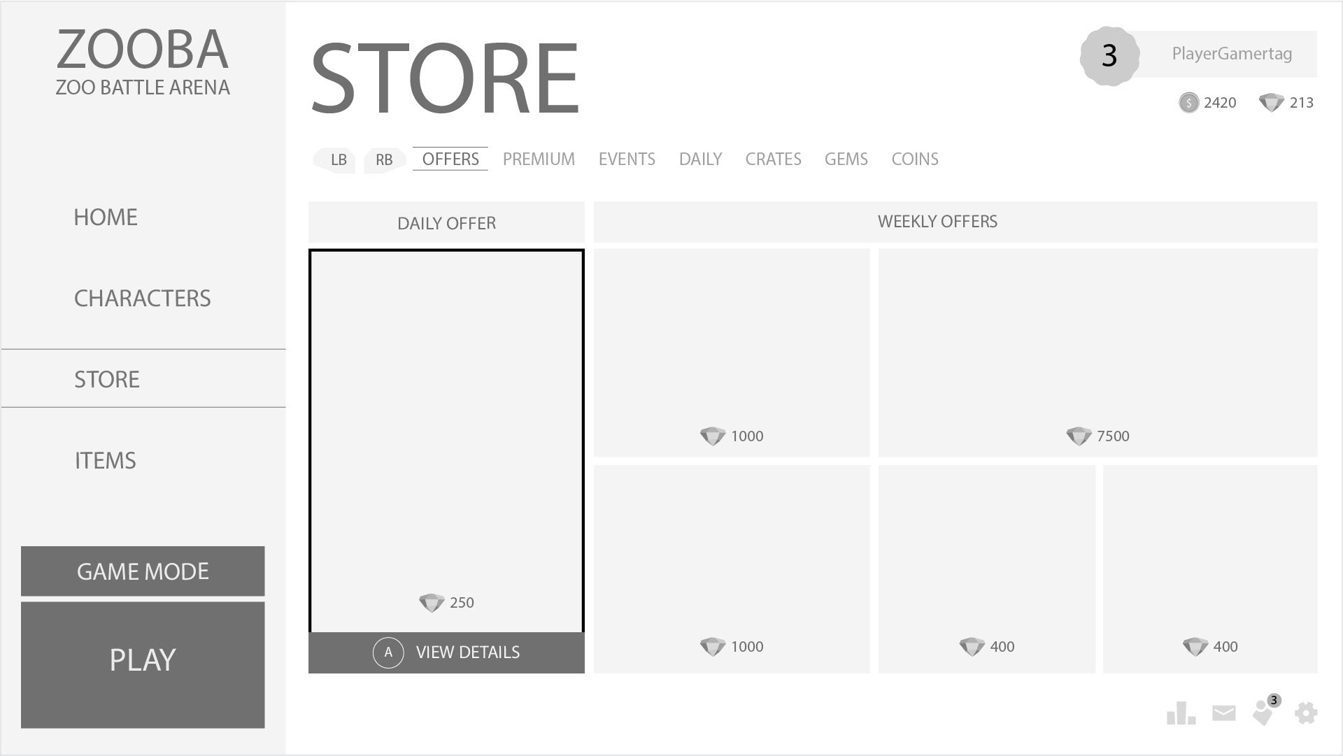
▪ Store: The modular grid layout organized content hierarchically, with larger tiles for featured offers and a top navigation bar for subcategories. I included a wishlist feature to give users more control over their purchases.
Phase 3: Testing and Iteration
Testing was an exciting and nerve-wracking part of the process. By leveraging insights from user feedback, community discussions, and simulated user interactions, I conducted A/B testing scenarios that compared the original mobile designs to my desktop prototypes. Observing how players would likely interact with the prototypes was incredibly insightful.
Based on this feedback, I made several adjustments:
▪ Increased color contrast for better accessibility.
▪ Refined hover animations to provide clearer feedback.
▪ Reduced the number of clicks required to access key features like the squad mode.
Design Solutions
Here’s a breakdown of the final designs:
Main Screen
Before: Equal emphasis on all buttons made the layout overwhelming.
After: The left-aligned menu streamlined navigation, while the squad mode button and character visuals became the focal points. This reorganization not only improved usability but also made the interface more visually appealing.
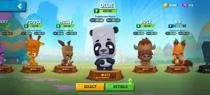
Before: Scrolling through characters felt tedious, and the prominence of the customization button often caused accidental clicks.
Store
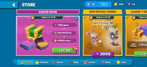
Before: The cluttered layout made it hard to spot featured items.
After: The modular grid showcased featured offers prominently, with subcategories accessible through a top navigation bar. The wishlist feature and currency tracker enhanced usability.
Reflections and Learnings
Looking back, this project was a significant learning experience in designing for cross-platform compatibility. Here are some of the biggest takeaways:
The Importance of Research
Understanding the audience’s needs and behaviors was fundamental to making informed decisions. While direct interviews were not feasible, analyzing feedback from reviews and community discussions offered rich insights.
Iteration and Flexibility
The testing phase taught me the value of refining designs based on observed interactions. However, it also required balancing feedback from multiple sources—sometimes conflicting—and prioritizing solutions that aligned with project goals.
Navigating Trade-Offs
There were moments where we had to weigh functionality against aesthetic choices. For example, while I wanted to retain Zooba’s playful and colorful design, some elements needed to be toned down to enhance readability and clarity on larger screens.
Challenges with Accessibility
Designing for accessibility introduced some constraints, such as maintaining high contrast without compromising the overall visual identity. These trade-offs required creative problem-solving to ensure inclusivity without losing the game’s charm.
Balancing Short-Term Goals with Long-Term Vision
Highlighting the squad mode as the centerpiece of the design was a strategic decision to drive immediate excitement. However, ensuring the interface could scale for future updates and features required extra foresight and flexibility in the layouts.
Despite the challenges, I’m incredibly proud of the final product. The redesigned Zooba interface not only addressed the pain points of the mobile version but also laid a strong foundation for its future on desktop and console platforms. Seeing the excitement around the squad mode and the positive reception to the new design was incredibly rewarding.
Thanks for reading! If you have any thoughts or would like to collaborate, I’d love to hear from you.
